

amazonインスタントストア レスポンシブ化
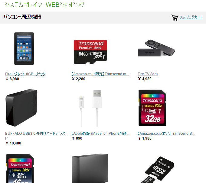
前回ご紹介したamazonインスタントストア。
これをレスポンシブ対応にするCSSをご紹介いたします。
CSSソースは以下の通りです。
body {
    width: 100%!important;
    margin:0;
    min-width:auto;
}

#wrap {
    width: 100%;
}

#mainwrap{
    float:none;
}

#main{
    width:100%;
    overflow: display!important;
}

div#contentsubheader {
    overflow: display;
    width: 100%;
}

table.products {
    width: 100%!important;
}

table.sidebarproducts,
table.sidebarproducts td.text {
    width: 100%;
}

div#footer{
    display:none;
    width: 100%;
}

#sidebar{
    float: none;
    overflow: display;
    width: 100%;
}

li.widget {
    width: 50%;
}

/*モバイル対応*/
@media (max-width: 640px) {

#header{
    max-width:100%;

}

#mainheadertitle{
    width:100%;
}

img#mainlogo {
    max-width:100%;
}

li.widget {
    width: 100%;
}

table.products .imagerow a img{
    width: 100%!important;
}


table#detailheader {
    width: 100%!important;
}

table#detailheader td{
    display:block;
}

table#prices td{
    display:table-cell;
}

#detailOfferPrice{
    display:block;
    width:100%;
}

}
不要な部分もあるかと思いますが、基本的に上記のCSSソースを以下の例に沿って張り付ければOKのはずです。
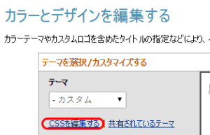
CSS適用手順
1.インスタントストアの”カラーとデザインを編集する”のページのCSSを編集するとクリック。
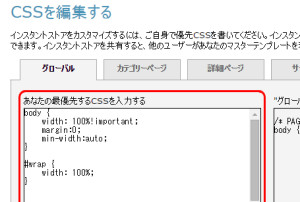
2.”あなたの最優先するCSSを入力”の欄に上記CSSを貼り付け。
ご興味ある方は是非試してみてくださいね~。
追記:
当サイトにしては珍しく、この記事に関するコメントを許可してみました。
「もっと良い方法があるよ」
「この部分はこう変えたらいいよ」
等アドバイスがございましたら、是非コメント欄にお書きください。
追記2:
2017年6月28日にamazonからアナウンスがあり、2017年10月27日をもってインスタントストアのサービス提供は終了となるそうです。
公開日:2016年3月15日
カテゴリー:NEWS


